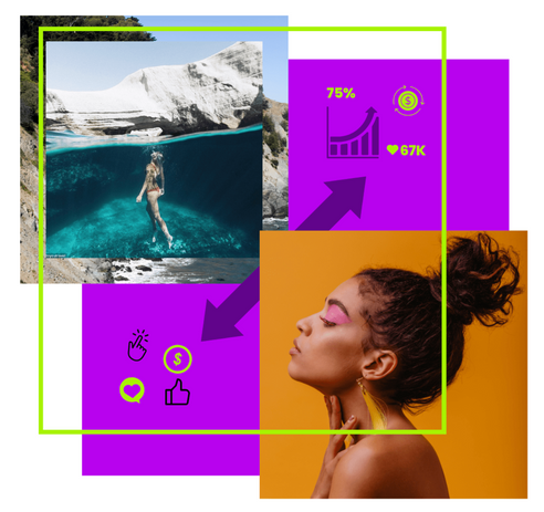
Rebranding WeArisma: Building a Brand Identity for a Data-Driven Platform
WeArisma, a rapidly expanding analytics platform, empowers brands and agencies to understand, measure, and optimise the return on investment of influencer marketing. Following a period of exponential growth and increasing media visibility, the company required a complete rebrand to reflect its maturity, data-driven proposition, and market leadership.
The new identity needed to convey innovation, trust, and clarity, aligning the visual language with the platform’s focus on data intelligence and measurable impact.
Objective:
Create a functional, future-proof brand system that would:
-
Reflect WeArisma’s evolution from start-up to established analytics partner.
-
Balance bold creativity with the discipline of a scalable design system.
-
Appeal to a B2B audience of marketing, data, and technology professionals.
Approach:
As Art Director, I led the design and strategy of a modular brand system that could evolve with the company’s growth while remaining flexible for both internal and external teams.
LOGO SYSTEM:
The brief called for a bold and fearless identity symbolising disruption and confidence. Multiple logo iterations explored the relationship between data connectivity and growth, culminating in a geometric wordmark that visualises precision and forward motion.
With these parameters in mind, I explored various logo variations and colour options. After further shaping and finessing, we landed on the winning combination of shapes, wordmark and colours:


COLOUR PALETTE:
To project energy and ambition, I developed a primary palette anchored in vibrant violet tones, complemented by calmer secondary hues. This combination represented the balance between innovation and stability, a key trait for a data-driven SaaS company.
TYPOGRAPHY:
The Poppins typeface was selected for its clarity, structure, and contemporary geometry. Its balanced letterforms echo the confidence of the logotype, maintaining a clean and accessible digital presence across applications.


PATTERNS AND VISUAL SYSTEM:
Triangular motifs derived from the logo formed the basis of a dynamic design system. These shapes were used as patterns, textures, and masks, offering visual flexibility while reinforcing the themes of growth, potential, and achievement. The modularity of the system ensured consistency across social media, UI interfaces, and marketing collateral

Delivery & Implementation:
To facilitate scalability, I produced a complete suite of templates for the creative and marketing teams, including presentation decks, collateral, digital assets, and business stationery. The new identity also informed the launch of WeArisma’s updated website and service ecosystem, enhancing brand cohesion and user experience.
Impact:
The rebrand repositioned WeArisma as a credible, insight-driven leader in the influencer analytics space. The new identity unified internal communications, empowered marketing teams, and provided a design foundation ready for future digital expansion.


