Designing a Scalable Brand Identity for Digital Connectors
Digital Connectors, a marketing partner for scalable B2B businesses, set out to redefine the meaning of digital success. Their mission was to help clients move beyond vanity metrics and focus on what truly matters: meaningful engagement and measurable growth. To achieve this, the company required a brand identity system that embodied partnership, intelligence, and human connection, while being flexible enough for in-house use across marketing materials and digital platforms.
Objective:
Create a future-proof, trustworthy brand that could:
-
Reflect simplicity, connection, and growth in a crowded digital market.
-
Empower the client’s team to manage and scale their communications independently.
-
Convey credibility and professionalism across B2B, marketing, and tech audiences.
Approach:
The rebrand centred on clarity, structure, and flexibility, ensuring visual consistency across all touchpoints — from logos and presentations to social media templates and website applications.
Result:
To ensure long-term scalability, I provided a Canva-compatible asset library and a brand usage guide, allowing the internal team to create on-brand materials autonomously while maintaining visual consistency. Through a strategic, design-led process, Digital Connectors emerged with a cohesive and professional identity that elevated their market presence and reflected their values of trust, innovation, and partnership. The rebrand not only clarified their visual identity but also established a scalable framework for communication ready to grow with the business.

Logo study:
Given the strong imagery in the name Digital Connectors, I explored several routes: combination marks, monograms, and wordmarks. The final solution (a clean, geometric wordmark) symbolised connection and upward growth. Two variants were produced: with and without tagline, ensuring versatility across applications.

Colour palette:
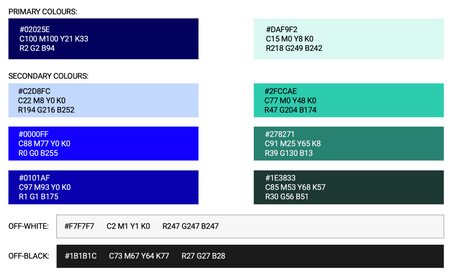
A refined palette of deep blue and mint green was selected to communicate trust, innovation, and accessibility, key values for a tech-facing B2B brand. Secondary tints and off-black/white tones provided balance and contrast, ensuring adaptability across both print and digital media.
Typeface:
Roboto was chosen for its mechanical precision and approachable geometry, harmonising with the logo’s angular structure. Its range of weights allowed flexibility in future digital and marketing executions.


